Kura Sake
Role
Graphic Design, 3D Design & Rendering
Year
2025
Location
Kurashiki, Okayama, JP
Project Details
Kura Sake is a modern sake brand rooted in tradition but created for today’s drinker. Our challenge was to design a brand identity that honors centuries of Japanese brewing craftsmanship while introducing a bold, minimal aesthetic that resonates with a global, design-conscious audience.
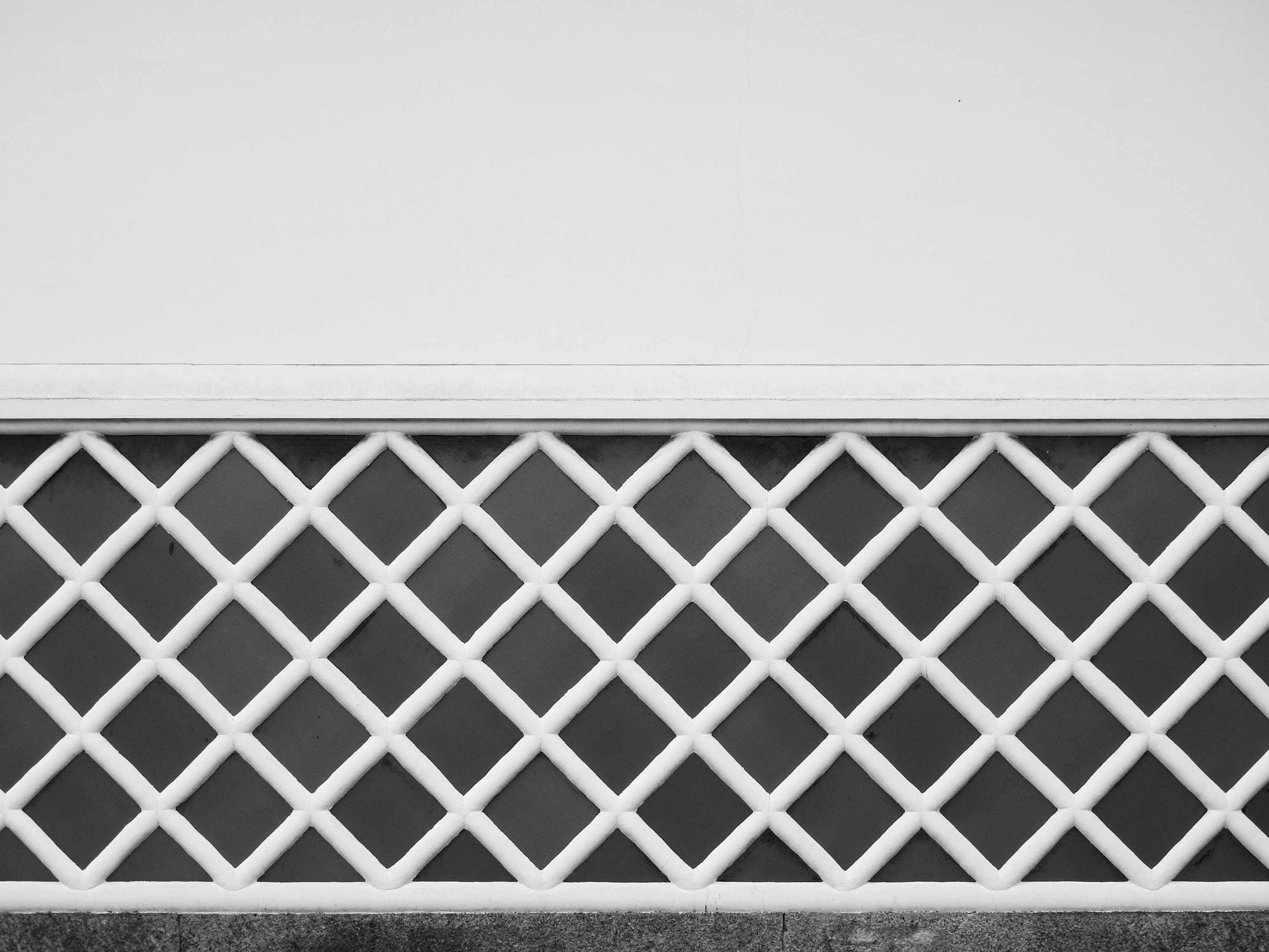
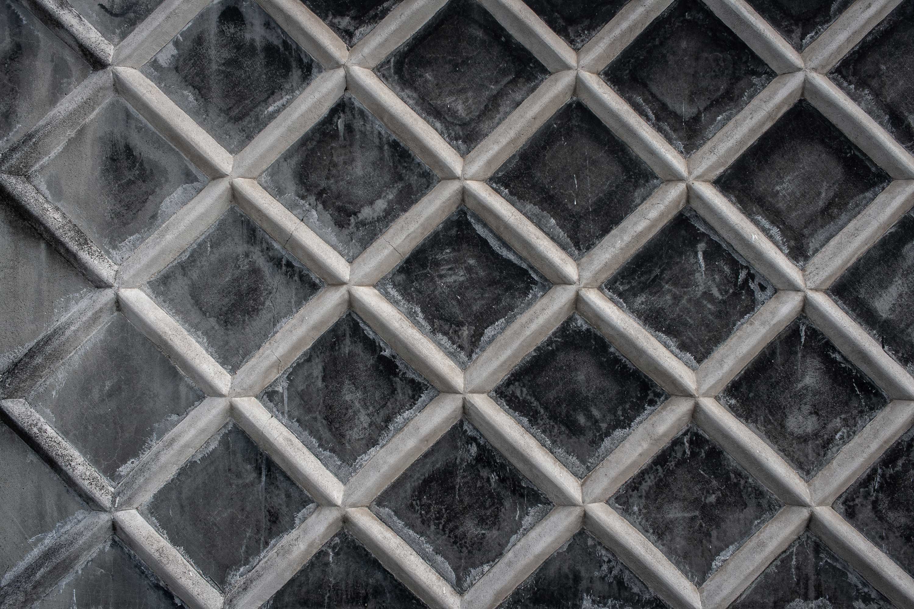
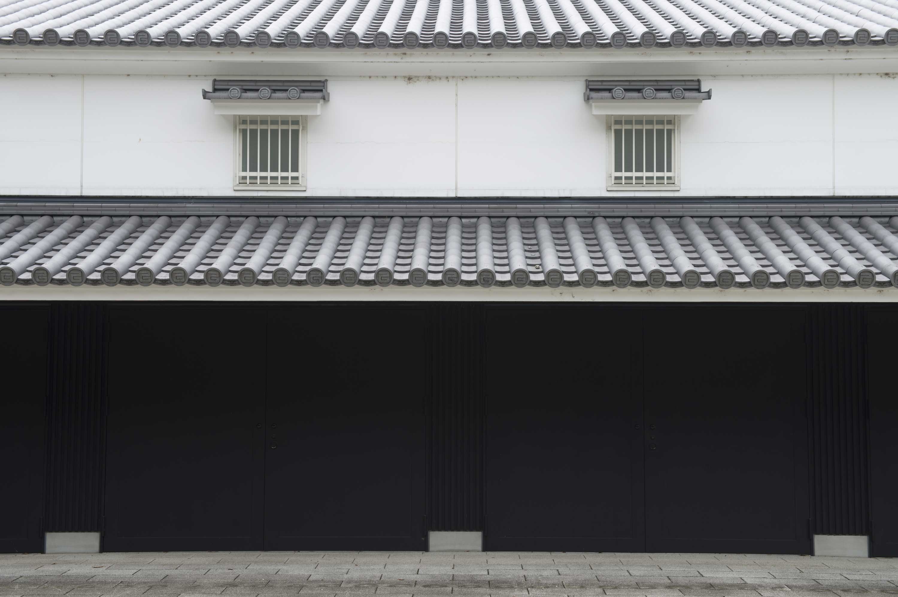
The name “Kura”, meaning "storehouse" in Japanese, became a guiding symbol — representing both the physical spaces where sake is aged and the careful preservation of heritage. The visual identity we developed blends clean typography with organic elements, creating a balance between structure and fluidity. The logo design features deliberate, simple lines inspired by traditional calligraphy, paired with a soft, natural color palette evoking rice fields, stoneware, and cedar barrels.
Packaging design was kept elegantly minimal, allowing the product and process to speak for themselves. We designed bottle labels that feel timeless yet fresh, using subtle textures and refined detailing to emphasize quality. Every brand touchpoint — from business cards to website — was built around the idea of quiet excellence: a brand that speaks softly, but leaves a lasting impression.
Through Kura Sake’s branding, we aimed to craft not just a visual identity, but an experience — one that invites drinkers to slow down, savor tradition, and find beauty in simplicity.
Kura Sake is a modern sake brand rooted in tradition but created for today’s drinker. Our challenge was to design a brand identity that honors centuries of Japanese brewing craftsmanship while introducing a bold, minimal aesthetic that resonates with a global, design-conscious audience.
The name “Kura”, meaning "storehouse" in Japanese, became a guiding symbol — representing both the physical spaces where sake is aged and the careful preservation of heritage. The visual identity we developed blends clean typography with organic elements, creating a balance between structure and fluidity. The logo design features deliberate, simple lines inspired by traditional calligraphy, paired with a soft, natural color palette evoking rice fields, stoneware, and cedar barrels.